The quality of your product images can make the difference between a user browsing and buying. Below are 11 of our best practices to take your product images to the next level.
How many times have you chosen not to buy a product online because of the image? Maybe you’ve decided against booking a certain hotel due to blurry or poorly lit property photos? In both cases, you’ve likely been victim to low-quality ecommerce images.
Most online marketers already understand the power of visuals in ecommerce. But even those with great product imagery can still optimize even further.
So why are high quality, compelling product images so important?
It’s simple. Since ecommerce removes the ability to touch and examine a product, the images (and video) become the most influential reference point for an online shopper_.
Whether you’re listing shoes or apartments, your customers will have similarly high expectations. But there will be some minor differences, so be sure to always keep in mind your target audience and their needs.
The benefits of high-quality product images are bountiful, powerful and sequential:
- Capable of grabbing the shopper’s attention
- Dramatically increase your click-through rate
- Drive sales while reducing cart abandonment
- Lower the chance of and thus number of returns or exchanges
- Enhance the overall customer journey and shopping experience
- Boost customer trust and retention
So why not do everything in your power to ensure your product images are at their best?
To help you take your images from mediocre to magnificent, we’ve listed 11 optimizations. The principles apply across industries, so whether you’re selling physical products or providing services, there is something to learn for everyone.
Before we begin, the most important thing to remember is: every channel has different image specs and requirements. Make sure you know when it’s okay to get creative and when you need to stay clean and simple. Generally speaking, product images on shopping channels (like Google Shopping, Google Hotel Ads, price comparison sites or meta-search engines, and marketplaces or OTAs) should focus more on the product itself. Product images used for advertising on marketing channels or with marketing partners, on the other hand, need to first capture the attention of the shopper who is not actively shopping at that point in time.
We’ve divided the different image optimization tips accordingly:
Optimization tips for product images on shopping channels, incl. online search engines
1. High-resolution is a must
Even if everything else about your picture is perfect, if the image appears blurry or pixelated, your hard work will have gone to complete waste. Low-resolution images are a huge no-go in the world of ecommerce, as it essentially eliminates the possibility of a shopper being able to properly examine your offer. It also makes your company seem less professional and trustworthy. Note that each channel and medium (desktop vs mobile) has varying requirements for resolution, so you’ll need to be aware of these rules before adding an image to your listing.
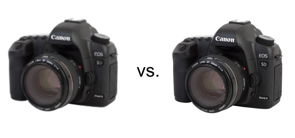
Expert tip: image compression should be your best friend. This essentially lets you reduce the file size, without losing the quality of an image. Since many channels limit file sizes, this can be an extremely helpful tool.
2. Accurate color & special light effects
Although this rings especially true for product images, accurate color and good lighting is key to high-quality ecommerce images in general. If a shirt isn’t the same color in person as it appears online, you can expect a high return rate and an influx of unsatisfied customers.
Expert tip: Play with shadows, but be cautious. Not much image creativity is allowed on channels like Amazon and Google Shopping. With drop or cast shadows being one of the few approved effects, consider using them to add more depth to your images. Shadows can be natural (i.e. made with natural light during the photoshoot via a window or reflective surface) or added during the post-production stage. However, if done quickly or unprofessionally, shadows can appear tacky and cheap.
3. Use different dimensions, angles, and perspectives
If there is one thing buyers want to know, it’s what they can expect from a purchase, be it a product or a hotel holiday or booking. So if your listing contains images from the same perspective over and over again, it’s not providing them much information to go off of. What does the back and side of the shoe look like? What does the lobby of the hotel look like? These are all questions that, if left unanswered, can steer people away from completing an online transaction purchase.
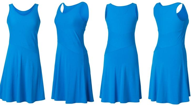
When using multiple images, however, you’ll then need to be sure to use the correct “hero image.” This is the image that will be displayed first out of the bunch. Note that this applies to both multi-image ads and product listings. This image should be captivating and should be the highest quality out of them all. Your hero image is what will gain the users initial attention and catch their eye in the crowded space.
Expert tip: Showcase unique characteristics__. Identify what makes your product or accommodation different from all the rest. Does your product include a unique feature? Does your hotel have a waterfall? Don’t be afraid to showcase these characteristics in an image. The unique aspects of your offer will intrigue customers and stick in their mind when comparing offers.
4. Crop intelligently
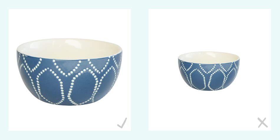
Every channel has their own rules on how and how not to crop an image. For example, on Amazon,the product itself should take up 85% or more of the image frame. For all channels, your entire offer should be visible and centered within the image frame. Moreover, all images should have a consistent crop, otherwise, your offers can appear sloppy.
Expert tip: Try to fill as much whitespace with the product as possible. Keep in mind that online shopping takes place across all devices. For shoppers using a large screen device, a product with excess whitespace around it may be difficult to view.
5. Clean and clear background
Most large shopping channels like Google and Amazon have strict guidelines regarding the background color of your images. For these channels, they should be plain white with no pattern, color, or special effects. The image should be of your product only, with no added accessories, unless they are included in the offer. This also means you should not include your company logo or any added text.
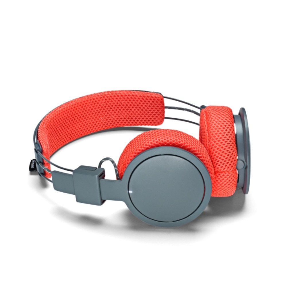
Images for items or property listings should be clean, clear, consistent, and compelling. If you follow the above optimizations, you’ll ensure that your customers are well-informed and confident about their purchase, reducing returns and increasing the likelihood of your product catching their eye.
Creative image optimizations for marketing channels and partners, incl. social channels, affiliate & retargeting engines
While creative images are forbidden on most shopping channels, they are encouraged in many ad formats. On Facebook and Instagram, for example, your product image becomes your ad image, or ad creative as you may call it. Here your image “does the talking” for you and should communicate the offer in a compelling way and at first glance.
1. Showcase key attributes
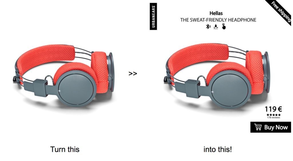
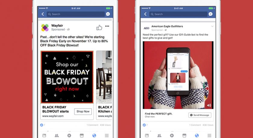
Take advantage of the fact that Facebook lets you use overlays, colors, unique fonts, and many other added features. Therefore, including key attributes like product or room price, product or hotel name, fabric type or current weather reports, can add significant value to your ad image. This is essentially a way to attract Facebook or Instagram users at the first touch point. Without even having to click on the ad, buyers will be aware of key decision-making information, which will ensure more clicks are highly qualified shoppers. This will not only add a burst of flair to your image, but it’ll undoubtedly ensure that your images catch the eye in a crowded newsfeed.
Retail example:
Travel example:
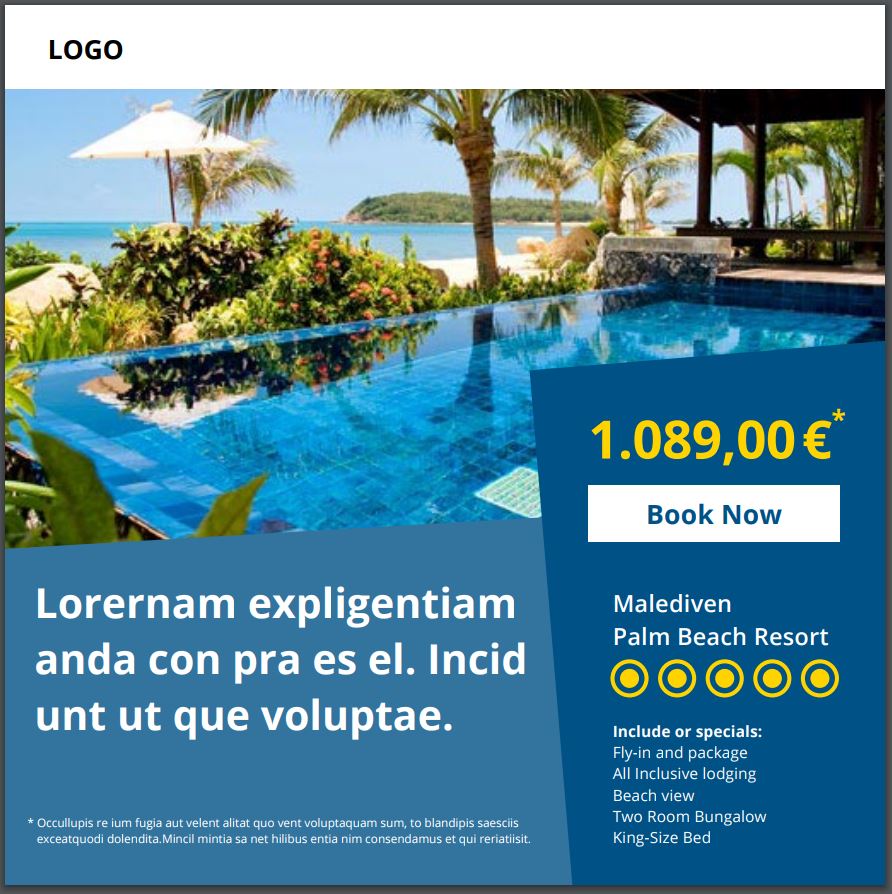
- __Stay true to your brand:__ Add a logo to your image to help shoppers easily identify who you are and what you are selling. This will help create strong brand awareness from the very beginning!
- __Add the price:__ Filter out unqualified shoppers right from the get-go by tacking on the price of the product
- __Additional information: __What makes your product unique? Is the shirt you are selling 100% cotton? Consider ahead of time all of the questions a user may ask themselves about your product. Try to answer as many of these questions in the first image they see!
2. Try a mosaic
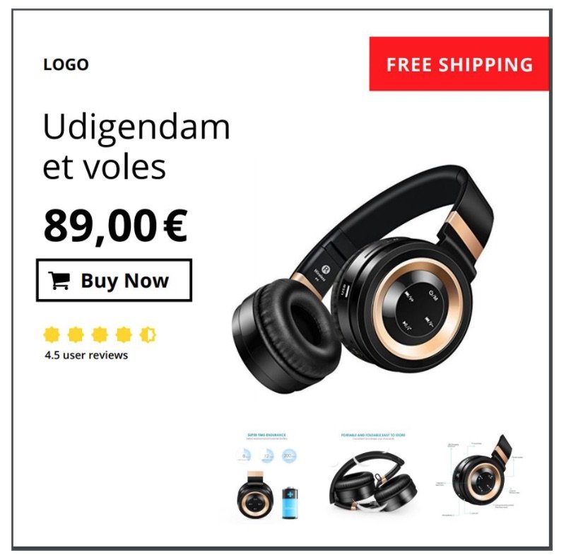
Consider creating a mosaic to showcase different product angles and perspectives in a single image. These are also a great way of telling the full product story straight-away via a compelling mixture of images. See the example below:
3. Get creative with the background
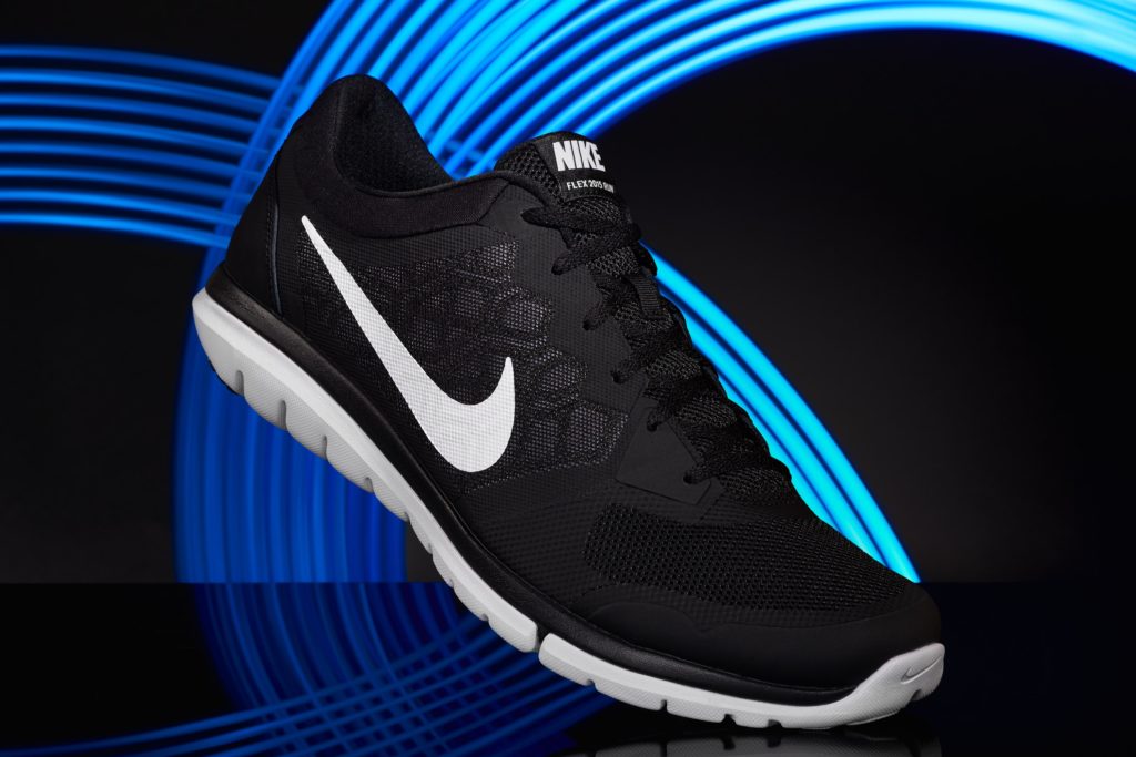
Unlike a marketplace or OTA, Facebook and Instagram don’t require a plain white background for your images. In fact, they want their advertisers to get creative. This means that you have the possibility to play with the background, set a scene for the product (while keeping them consistent to help make your brand recognizable), show the product in action (e.g. a man wearing a shirt to a party), highlight the use case (e.g. show someone wearing your rain jacket in the rain), or even use visual effects like captivating lighting. Since you want your ad to stand out from the crowd, using a backdrop that catches the eye is a great way to add more power to your photo. Here's an example:
4. Promote special offers and customer reviews
Adding promotional text, e.g. “discount” or “sale,” to your image can be a great method of attracting new customers. Since the ads are being displayed to users who’ve shown previous interest, adding an extra incentive directly on the image could be the final push they need to make the purchase or booking.
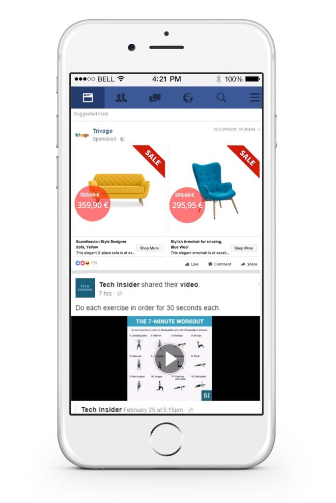
Also, consider adding customer reviews to your images. Doing so will enhance customer trust and compel more unsure users to click
5. Take advantage of holidays and special occasions
Ad images and ads, in general, should always aim to trigger an emotion. Above all else, you are targeting a human being. Therefore, taking advantage of holidays i.e Mother’s Day can be a good way of sparking emotion, thus gaining the audience's attention. Consider making use of holiday-themed creatives or color palettes, i.e. red for Valentine’s Day, that portrays relevance during a specific holiday.
6. Have your images interact with each other
Above all else, understand that yourimages should tell a product story for your buyers. Since most channels allow you to submit multiple images, you have many opportunities for them to interact with each other, which can help your images speak for (and sell) themselves. For example, perhaps the first image shows a shoe from the front, and the second shows it from the back, the third from the side, etc. This will encourage users to click through all of the images to see the entire product or offer.
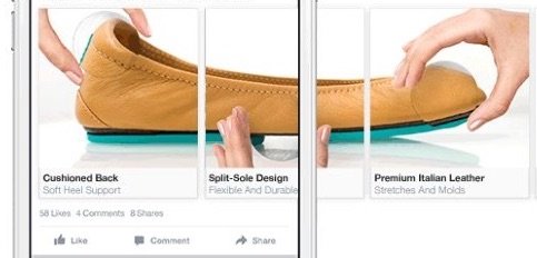
Alternatively, if you’re using the Facebook carousel ad format, for example, you could cut the image into three sections. Once the images are side-by-side, users would see the entire product offer. This encourages users to view all of the images and is a creative way to catch their attention. See an example below:
Wondering how these creative optimizations can be done when you have so many products? Easy! Productsup has a built-in Image Designer to efficiently create dynamic ad templates for all of your product or hotel ad images! Interested? Learn more about the Productsup Image Designer here.
This updated post was originally published on February 8, 2018.

![[WP Import] 11 tips for high-quality product images](http://images.ctfassets.net/q17uls4wkkdz/64U1OAoB7Do3xhPaptlTey/59540069a04c7c91bf82ee704285ffca/11tips_feature_image.jpg)


